
We get this question a lot at Plexon, both from brand-new labs and labs that have been recording for years. However, when spike sorting, a “good” unit is very subjective and depends on several things: the recording region, what electrodes are used, how secure the animal ground is (see ground vs reference blog), and even things that can vary day to day, like the noise in the room during that recording.
Because of the great variation that can exist between units, it is difficult to give concrete rules for defining good units. However, there are many features that can be found in Offline Sorter that may help you make a decision while spike sorting.
We recommend that a lab uses multiple spike sorting criteria to validate a unit. These criteria should be based on a known good recording the lab has done themselves, or if the lab is just starting, a recording done by a colleague or reference paper under conditions as close as possible to what the lab is using. For example, it doesn’t make sense to base a good amygdala unit collected on a tungsten wire on criteria that another lab has for good cortical neurons collected on a silicon probe.
Below are ideas for characteristics you can find in Offline Sorter to use as criteria to define an acceptable unit when spike sorting.
The number of waveforms in the unit.
While some neurons don’t fire often, too few waveforms could indicate the unit is periodic noise. Additionally, analysis of a unit with too few waveforms may not be useful, or could even be misleading, as the number of spikes is too few to have a meaningful impact.
In the default view of Offline Sorter, the spike counts in each unit can be found in the Units window.
In the below image unit C (light blue) has 1419 waveforms, while unit A (yellow) only has 246. Unit A may not be ideal for analysis depending on the details of this recording.

Number of waveforms that violate the inter-spike interval.
The inter-spike interval is the time between sequential waveforms in a unit. Neurons have an absolute refractory period after an action potential during which another action potential cannot physiologically occur. Therefore, if the inter-spike interval between two waveforms is less than the absolute refractory period, at least one of the waveforms is unlikely to be a true physiological response. However, having at least some violations in a unit is not unusual because it is extremely difficult to sort a unit without any noise. Therefore, many labs set a maximum percentage for how many violations can be within a unit.
By default, the inter-spike interval is set to 1ms in Offline Sorter, but this can be changed in the Control Grid View window.
As with spike number, the percentage of inter-spike interval violations is shown in the Units view.
Unit C (light blue) below, shows an ISI of 0.1%. This means 0.1% of the waveforms sorted into unit C occur too close together to be a true physiological response.

Waveform shape (template)
This criterion can be more subjective as units have different amplitudes, valleys, widths, etc., based on the region and how close the cell is to the recording electrode. However, in an extracellular recording, a unit template should resemble an inversed action potential (when using a negative threshold).
In addition to the default views in Offline Sorter, if you select ‘View Only Currently Selected Unit’ from the Waveforms dropdown menu on the toolbar, you can independently view each unit and its waveforms.

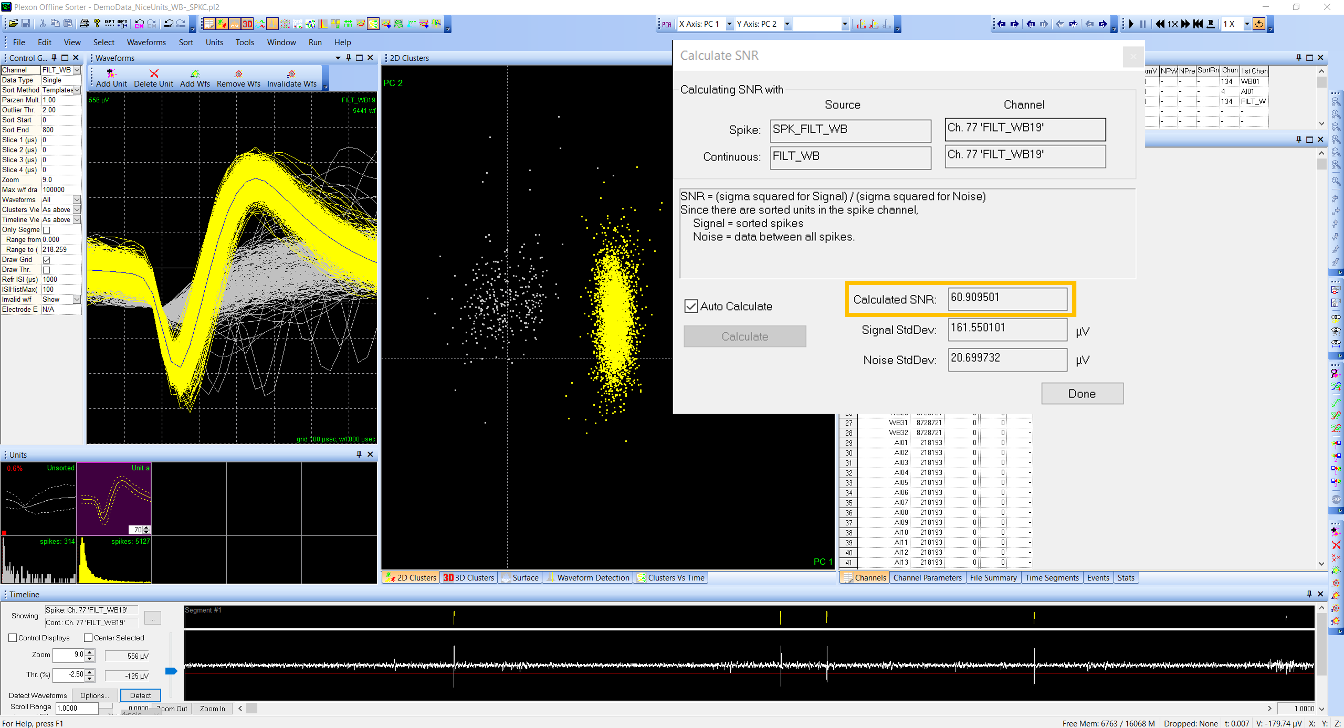
Signal-to-Noise Ratio (SNR) – this is a common ratio used to quantify the quality of a unit when spike sorting.
In Offline Sorter, it compares all sorted waveforms to all non-waveform data in the channel (this means the data file must contain continuous data to calculate the SNR). A large SNR means the unit is likely to represent spikes from a source located near the recording site, and a very large SNR is sometimes considered evidence for recording from a single cell.
The below image shows a large SNR for a channel with one unit. Channels with multiple units combine waveforms for all sorted units to compare with continuous data.
Cluster separation and cluster quality.
Many sorters, including Offline Sorter, use a Principal Component Analysis (PCA) to reduce the dimensionality of the data into features that describe the most variance in the data. The principal components are where the data vary the most, and therefore, we can use them to find the data that are “different,” or in other words, separated from noise.
Offline Sorter calculates the first eight principal components per channel by default, which can be plotted in feature space. When graphed, the waveforms tend to form groups, or clusters, of data that have similar features. (Note: PC1 vs. PC2 is the default 2D feature plot, but other features, like energy and timestamp, can be substituted). Automatic sorters use these clusters to group data together into units. Or, if it’s the lab’s preference, the clusters can be sorted manually into units.
A “well-separated” unit is a tight cluster that is plotted in a different area of the feature space graph compared to other clusters (which may be noise or other units). How well separated the cluster is in feature space can be used as a criterion for a good unit. However, this can be subjective and has the pitfall that low amplitude units often get grouped into the noise cluster.
L-Ratio and Iso Distance (cluster quality).
These are measures developed for neural data as a quantitative way to represent cluster quality and can be used as support for defining a valuable unit when spike sorting. That is, the L-Ratio and Isolation Distance provides a number to represent how separated a cluster is. They do not calculate if a cluster is significantly different from others.
The L-ratio is a measure of how close noise, or non-unit, waveforms are to a cluster’s center. A LOW value indicates there are FEW noise waveforms close to the unit’s cluster.
Isolation Distance is a measure of how far away non-unit spikes are from the waveforms in a cluster. A HIGH isolation distance means non-unit waveforms are FAR AWAY from the cluster.

Cluster continuity over time (cluster quality).
Over long recording periods, or if you are trying to track a single unit across recording days, a unit’s template and cluster may drift, meaning they change. This can be due to a variety of factors. One way to determine if similar waveform shapes may be the same unit that drifted across the recording period is to look at the clusters over time. If the units are truly separate instances, the clusters will be continuous over time and will not overlap.
There are two ways to view clusters across time in Offline Sorter.
The first is the Clusters vs. Time view found in the View drop-down menu on the toolbar. This shows the Time Segments overlayed onto the graph of PC1 vs. PC2. This view is especially helpful if you are interested in specific time segments during the recording, which you can add/ modify in Offline Sorter.

However, you can also add Timestamps as a feature, and look at the 3D Clusters plot. Timestamps will need to be added as an Active Feature in Options| ActiveFeatures before it can be selected as a plottable feature. These graphs show the same information as Clusters vs. Time, but they don’t overlay the Time Segments, and therefore, it is easier to visualize the individual waveform points in each cluster.

Using Per-Channel and Per-Unit Statistics for Spike Sorting.
Being scientists, it is in our nature to want an unbiased number by which to make our decisions. Offline Sorter calculates some statics; however, these should never be used alone to determine if a unit is acceptable. These statistics must be used with at least some of the criteria above because even statics have pitfalls. For example, all the statistics in Offline Sorter are based on feature space; therefore, if the clusters are not well-separated, these statics are unlikely to be decisive in deciding if a unit is acceptable. A clear and defined waveform shape, low ISI violations, and an acceptable number of waveforms may be enough evidence to accept a unit as good, even if the unit’s cluster is not extremely well separated from the background noise.
I will not cover each statistic provided by Offline Sorter in detail. User guide section 6.6 – Sort Quality Statistics, goes into detail for each calculation.
Here, I will give an overview of what is available, and talk about a few that I find valuable and easy to understand. I am not saying that some are better than others, each lab should decide for itself based on their data.
Per-channel statistics. Offline Sorter calculates a MANOVA in 2D and 3D space. The difference between 2D and 3D is how many features are included in the calculation, 2 or 3 (Note: if you are doing 3D statistics, check what your third feature is in feature space, as this will change what is used as the 3rd feature in the analysis).
The per-channel statistics test the null hypothesis that all clusters are part of the same cluster. Therefore, a significant result means that the clusters are statistically separated in feature space. This analysis can be done with the unsorted waveforms as a unit or without the unsorted waveforms if you are interested in differences between the sorted units only. Including the MANOVA, Offline Sorter also calculates per-channel statics using the J3, Pseudo-F, Davies-Bouldin, and Dunn tests so you can choose your favorite. Each test works slightly differently, so one may be better for your data than another.
Per-channel statistics are most helpful when you have only one or two clusters. If the per-channel statistics are significant, but you have three or more clusters (including or excluding unsorted), you may need to use the pairwise unit statics to determine which clusters are significantly different from each other.
Pairwise unit statistics are available for all the same tests as the per-channel statistics and in 2D and 3D. I personally like the p-value and J3 pairwise results because they are the easiest for me to understand. Everyone is familiar with a p-value, and 0.05 is typically acceptable as the significance threshold. For the J3 statistic, the larger the value, the better. An acceptable minimum J3 value should be determined by your data, but I find that a value of 1 is a good minimum to start with.
Many of the pairwise statistical tests will give similar results. However, this is not always true due to the differences in how each statistic is calculated. For example, the Pseudo-F test is very similar to the J3, but controls for waveform and unit counts. Therefore, the lab should consider which test is most appropriate for their data and always refer to the results of that particular test.


Written by Kristin Dartt