Principal component, or PC, is a term that people encounter when sorting units in Offline Sorter. It is a common visualization to graph the first two principal components as the X and Y axes in a feature-based cluster graph. It is called feature space instead of component space because other aspects of the waveform can be used on the axes, such as timestamps or non-linear energy.
Principal components can be complex to understand. However, when boiled down to their essence, principal components represent variability. Therefore, the closer waveforms are in a feature space graph using principal components as the axes, the more similar they will be.
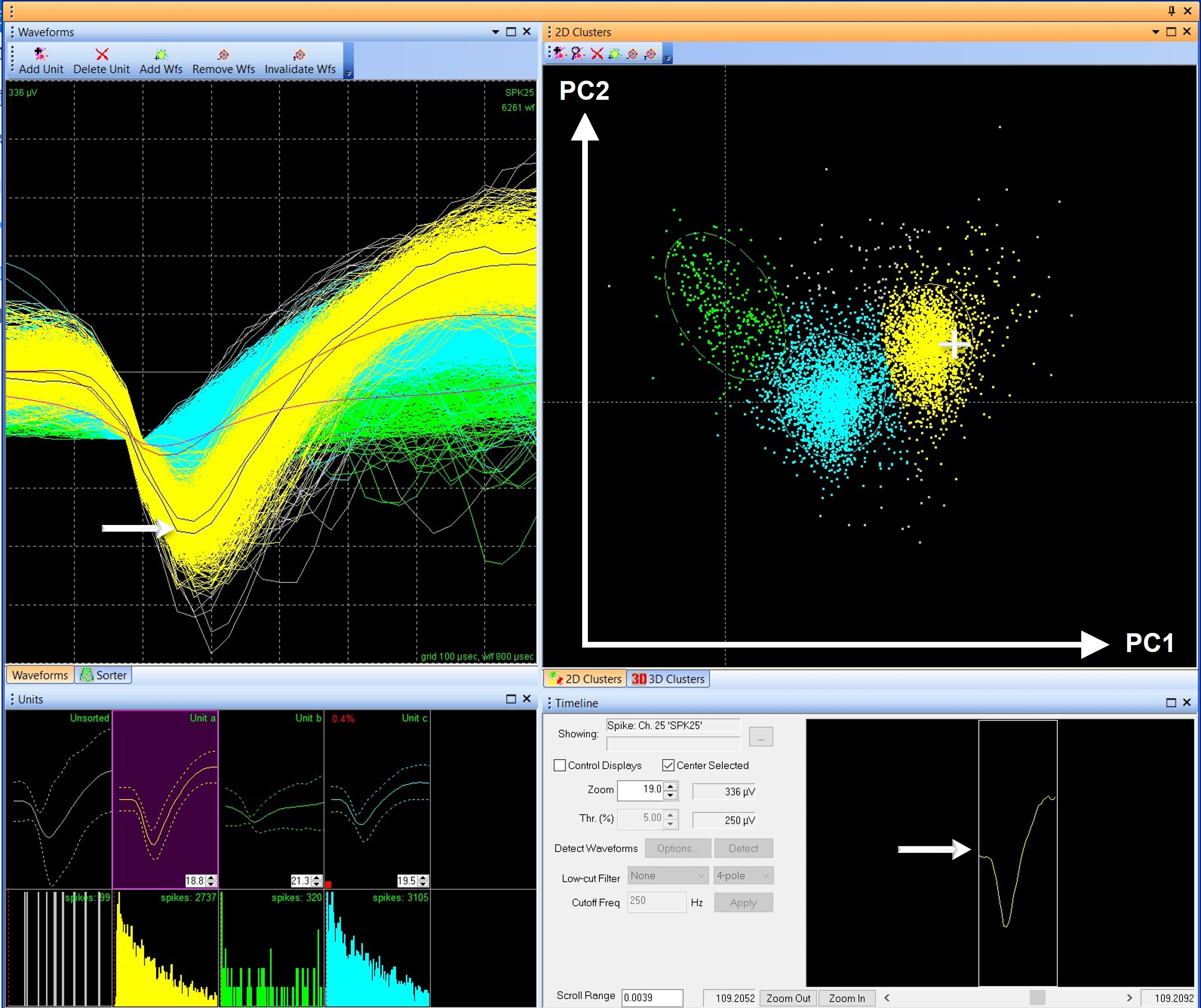
FIGURE 1. Like waveforms group together in clusters in feature space
Figure 1 shows multiple views of waveforms in Offline Sorter. The 2D Clusters graph, which by default in Offline Sorter uses principal components 1 and 2 as the X and Y axes, plots a dot for each waveform. Clicking and holding the cursor over a dot on the graph will show the corresponding waveform in the Waveforms and Timeline views. In Offline Sorter, each unit is a different color, making it easy to see that each cluster in the 2D Clusters graph contains waveforms of similar shapes. For example, in Figure 1, Unit a (yellow) is well separated from Unit b (green), and they have dissimilar shapes in the Waveforms and Units views. Unit C (blue) is in between because it shares the characteristics of both Units a and b.
Because the principal components make it possible to say waveforms have similarities or dissimilarities based on their location in feature space, the clusters are used as the foundation for many automatic sorting methods like K-means, Valley Seeking, and T-Distribution E-M. However, the ability to compare and group waveforms by using principal components in feature space also causes confusion about what principal components truly represent.
Since the location in feature space represents how similar waveforms are, can the principal components tell users anything about the shape of a waveform or perhaps give insight into the parts of a waveform that make it significantly different from another? Plexon often receives questions like these from users struggling to understand what the principal components in a feature-based graph represent. These users are generally trying to work backward from the position of the waveforms in the 2D Clusters feature space graph and determine which characteristics of the waveforms are “most important.” These questions highlight a common misunderstanding of what the principal components represent.
The goal of this blog is to help users understand what is represented by the principal components, and what is not.
The simplest answer is that the principal components represent the mathematical variability (differences) between the waveform shapes, which allows waveforms to be grouped together based on likeness when graphed in feature space. However, the principal components do not directly represent the characteristics of the waveform, like peak-valley height or peak width.
But let us discuss this in more detail.
Neuronal data has high dimensionality, or complexity. In a Plexon system, the default 800 µsec waveform length, collected at 40 kHz, has 32-voltage values for each waveform. The template lines for each unit in Figure 2 have squares indicating the 32 A/D points of the waveform, and each recording channel may have tens of thousands of waveforms. With thousands of waveforms, each with a different shape, grouping them into units can be difficult based solely on the waveform visualization. In Figure 2, for example, it would be very difficult to differentiate the three sorted units based only on the unsorted Waveforms View (right-hand panel).
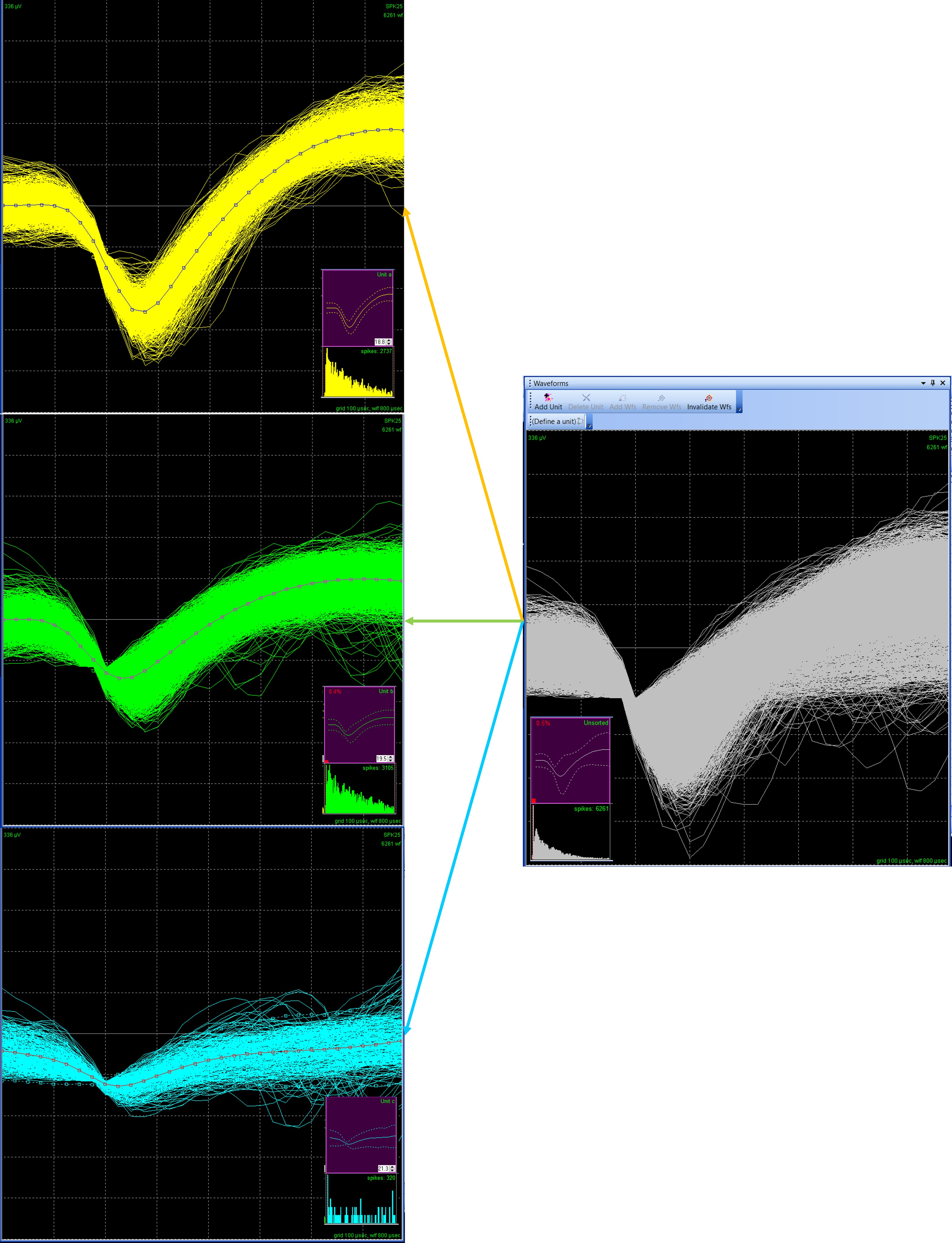
Figure 2. Waveform with 32 A/D values
Principal Component Analysis (PCA), which is the mathematical function that derives principal components, is a type of dimension reduction and is used to distill the data down into manageable and informative bite-size pieces. PCA takes the high-complexity waveforms, and, in simple terms, prioritizes parts of the data. Which parts does it prioritize? The most variable, or where the most differences occur.
An in-depth discussion of the mathematics behind PCA is beyond the scope of this blog¹, but there are a few key components to keep in mind. PCA is a linear algebra function that pulls out information from a matrix array. In this case, the array used is a covariance matrix calculated from the waveform data. The key takeaway is that the PCA is looking at mathematical variation, not directly at features like the amplitude of the waveforms.
The resulting principal components represent the parts of the data where there is the most mathematical variance. The variance is defined by pure mathematics, and the PCA does not output which data point(s) or feature(s) contribute to the variance explained by each principal component.
What the PCA does output is an eigenvalue and an eigenvector.
The eigenvector is better known by the more common name, principal component. A principal component represents the variance in the data. However, we gain an additional understanding of what this means by using the term eigenvector.
In simplistic terms, an eigenvector is an axis, or a direction. This means the principal component is an axis, which measures the variation of the data in that dimension. This is like saying the X-axis is time and the Y-axis is height on an X, Y cartesian graph. Except in this case, principal component 1 is the variance of the data in one direction, and principal component 2 is the variance of the data in another direction. Each waveform will have a location on the principal component axis. Offline Sorter calculates 8 principal components², therefore, each waveform can be thought of as having an 8-dimension “address” in principal component space.
Importantly, the first principal component explains as much variance as possible, the second explains the most residual variance, and so on. Most of the variability is explained by the first few components, which is why only the first 2 or 3 principal components are graphed by default in Offline Sorter.
The second result from a PCA, the eigenvalue, is the magnitude of that variance. In other words, the eigenvalue represents how much variation is explained by that principal component. The eigenvalue is how we know the first few components are the most important to consider. Often, an eigenvalue is scaled so that it can easily be read as the percentage of the variance explained. In Offline Sorter, the eigenvalues can be found in the PCA Stats view (Figure 3).
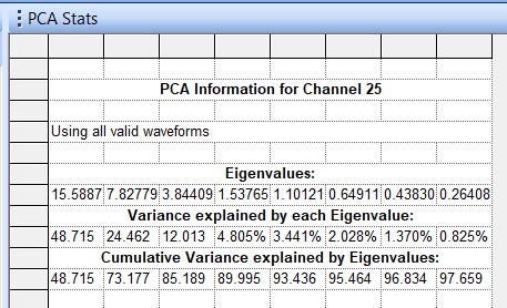
Figure 3. PCA Stats – Eigenvalues
The eigenvectors are represented on the feature-based cluster graph, and the eigenvalues can be found in the PCA Stats view. In addition, there is a PCA Results view in Offline Sorter. This graph can be difficult to interpret, so I caution against reliance on this visual representation.
The PCA Results graph projects the 32-point waveform onto the principal components. This is a mathematical manipulation of the data. The purpose of projecting the waveform onto the principal components is to create a simplified visualization of the waveform data that highlights areas of high variability. Remember, PCA is a data reduction technique, which is nicely illustrated by the PCA Results graph, which distills all the waveforms in all the units, down to 8 principal component lines, each representing some portion of variation in the original data.
Each line in the graph has 32 data points like the original waveforms. The value of each point is now a representation of variation calculated by PCA, not the voltage value. Because the variance is directly related to the shape of the waveform, the projection may resemble a waveform in at least some aspects. For example, in Figure 4, for the first principal component (yellow line), the data show variation in locations where one would expect waveforms to be different, including the peak amplitude and hyper-polarization period.
Do not be confused, this graph is not the original waveform or unit. Although the colors are similar and the PCA Results can resemble the waveform shape, the graph DOES NOT DIRECTLY REPRESENT A WAVEFORM or UNIT. It is also important to keep in mind that, like the clusters on the feature-based graph, the PCA Results graph makes no claims on significant features of the waveform data.
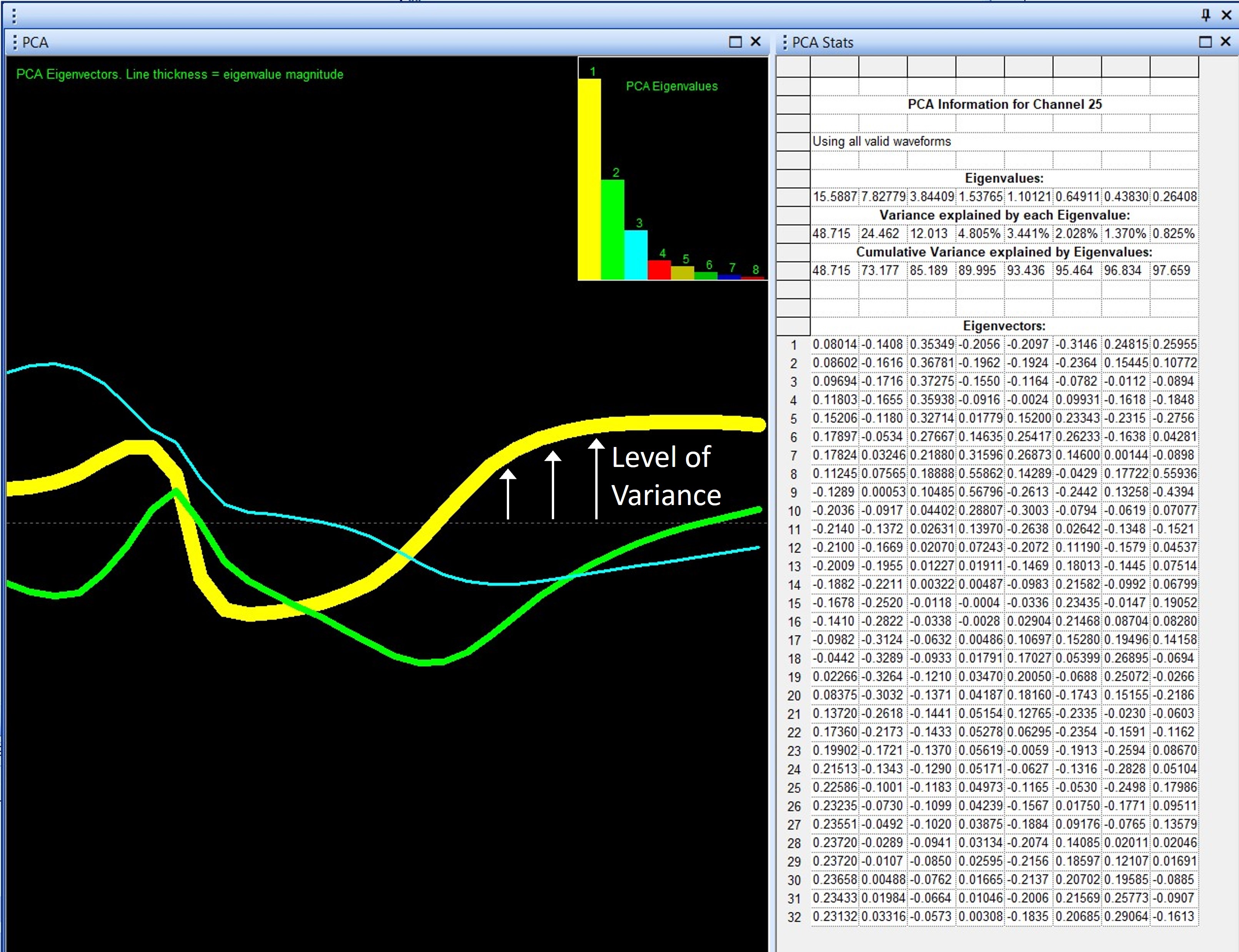
Figure 4 – PCA Results View Graph
On the PCA Results graph, principal components other than the first are even more difficult to interpret. Remember, each principal component is an axis, and this means it must be orthogonal (at a right angle) to the preceding component. This is not essential for understanding what the principal components represent for spike sorting, but it further complicates how to interpret the PCA Results graph. For principal components 2, 3, and above, this additional factor must be taken into consideration. The PCA results graph will resemble the waveform shape less and less in higher principal components.
Finally, the width, or thickness, of the line indicates the magnitude of the eigenvalue. Thus, the line representing principal component 1 will always be the thickest line. In general, with the added complexity of interpretation of orthogonal principal components, the PCA Results view graph is most useful for principal component 1.
To summarize, here is a simplified list of what the principal components are, what they cannot tell a user, and how principal components are displayed in Offline Sorter.
What principal components tell us…
- Principal components can be graphed in feature space – where waveforms with similar variability will be grouped together.
- Principal components represent variability in the data.
What principal components do not tell us…
- Principal Components do not determine which characteristics of the waveform are significant.
- Principal Components do not statistically compare similarities or differences between units.
In Offline Sorter…
- Principal components, or eigenvectors, are used to cluster like-waveforms together in feature space to aid in sorting.
- The eigenvalues, or amount of variance explained by each principal component, are found in the PCA stats view.
- PCA Results view is a projection of the waveform onto the principal components and is a visual representation of variability, but this view should be interpreted cautiously, especially for higher-order components.
- If you are interested more in the math behind the PCA, I recommend (A Beginner’s Guide to Eigenvectors, Eigenvalues, PCA, Covariance and Entropy | Pathmind), which does a great job of explaining matrix math without a lot of math.
- Only 8 Principal components are calculated, because further components explain very little variability. The most variability is contained within the first 2-3 components, and very few people consider high-order components.

Written by Kristin Dartt