
Overall conclusion: pMAT is more user friendly, but GuPPY has more options and flexibility
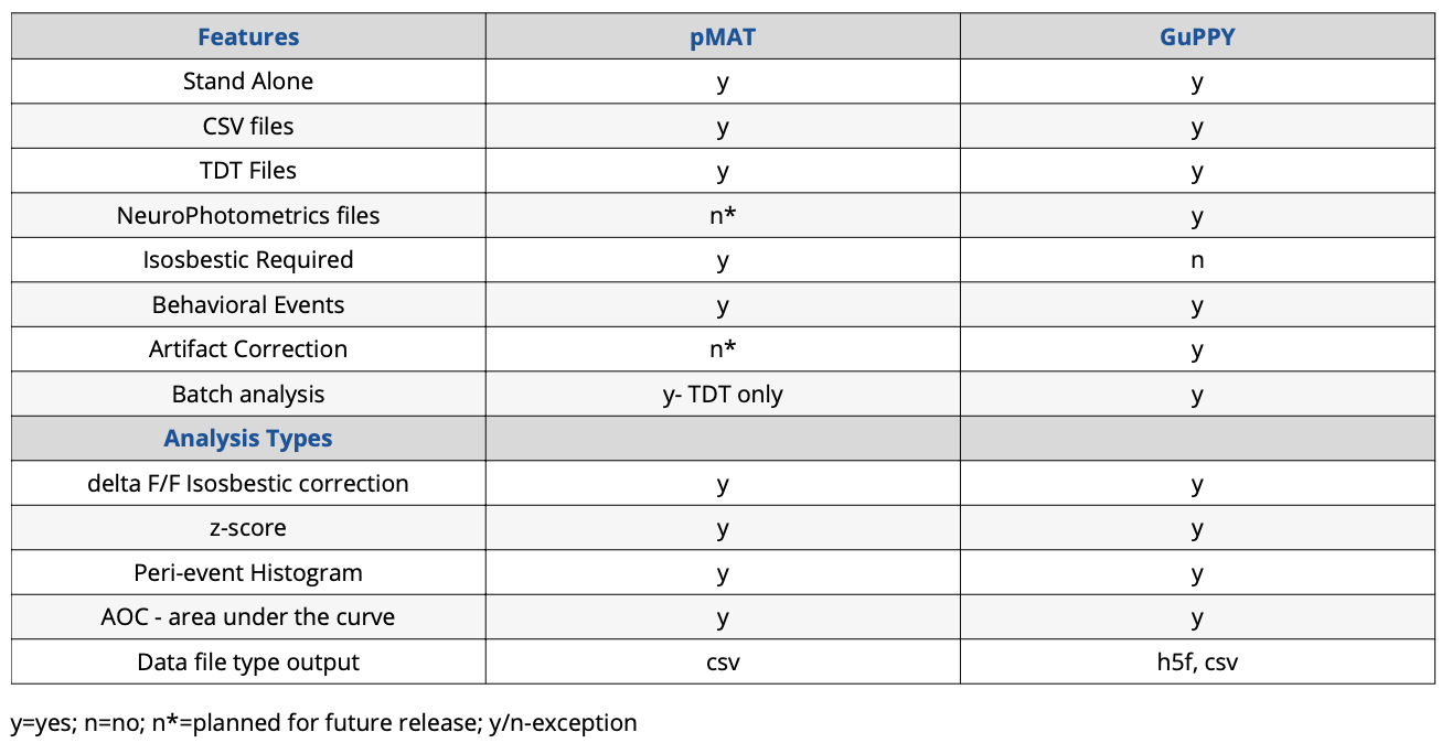
Summary Comparison Table
One of the major hurdles for a lab performing fiber photometry is data analysis. Using and applying an isosbestic control requires a complex set of mathematics and understanding how to do this correctly is difficult for someone just starting with the technique. Perhaps the barrier is a lack of coding experience in the lab, which makes it difficult to apply the complex calculations to a set of data. Or the reason could even be that it is unclear which analyses are appropriate for fiber photometry data. Whatever the reason, it is becoming apparent to the research community that a standard method needs to be set.
In early 2021, the David J. Barker lab at Rutgers and the Talia N. Learner lab at Northwestern published open-source tools for analyzing fiber photometry data, called pMAT and GuPPY, respectively. These tools use different platforms and slightly different mathematics, but they both apply a motion artifact correction (isosbestic or other) and analyze the photometry signal around a behavioral event. These open-source tools are not all encompassing for every data type, but they represent the beginning of standardized fiber photometry analysis.
It is my goal in this article to give my experience with these two tools when analyzing data collected from the Plexon Multi-Wavelength Fiber Photometry system.
The Test Data
The data I used for testing pMAT and GuPPY was collected on a Plexon Multi-Wavelength Fiber Photometry system (v1). It was a single session with one mouse and therefore not representative of all photometry data types or situations. Data were collected in a collaborator’s lab with all required institutional IACUC protocols.
A data signal, using 465nm LED, and an isosbestic signal, using a 410nm LED were used. Fluorescent responses from DLight and isosbestic control centering around 525nm were collected. At the beginning of the recording the LEDs were off, therefore the first 1713 datapoints (~58sec) had to be removed from the beginning of the file. This was done in pMAT and GuPPY as both have the option to excise the beginning of the datafile.
The mouse was free roaming in an open field. A response was elicited by an AirPuff. Delivery of the puff was marked by a keyboard entered TTL event. This means the TTL event is not perfectly time-locked to delivery (this is important to consider when comparing data output).
Initial Impressions & Install
Both GuPPY, which uses Anaconda/ Python, and pMAT, based in MATLAB, are completely free open-source tools.
If you have not read the Bruno et al. paper describing pMAT you may initially think a MATLAB license is required. However, I was happy to discover that pMAT can be run as an independent application. However, if your institution/ lab has MATLAB (and the curve fitting toolbox), you can also run pMAT from the command prompt.
Both GuPPY and pMAT have their strengths and weaknesses. Overall, I found pMAT easier to install since it uses an .exe file, like any other program you download from the internet. Installing GuPPY had many more steps, some of which required going through the Command/ Anaconda prompt. This may be intimating to those new to Python. However, GuPPY has thorough instructions and walkthroughs on GitHub.
I found the initial impressions from the installation to be true for using the applications as well. pMAT’s options are all displayed in one window and are straightforward: check this box here, enter number of seconds there, click the start button, out comes some graphs and csv data files. I did not have any issue getting pMAT to work for my test data.
GuPPY has more flexibility on data input, allows batch file and group processing, and has other useful tools like artifact removal, but it is much stricter on file naming and formatting. Almost immediately I ran into errors, even when using the sample data. However, once I figured out what I was doing incorrectly, running the analyses, changing parameters, and visualizing the data in the graphical user interfaces became straightforward.
Output of pMAT and GuPPY
Here I will discuss the data output from pMAT and GuPPY. In the next installments I discuss my experience with each open-source tool in more detail including csv file formatting, importing data and errors I encountered.
Between pMAT and GuPPY I kept the analysis parameters as close as possible. However, there were slight differences that may contribute to my results below. For instance, pMAT asks how many data points you want to remove from the beginning of the file, while GuPPY asks for seconds. At 30Hz data collection a second is 30pts of data. This can affect how data are binned for further analysis. I have included screen shots of the analysis parameters I used in GuPPY and pMAT at the end of this article.
The underlying equations and data binning are slightly different, but both offer the same analyses:
- Motion artifact correction (isosbestic or equivalent) and z-scored traces
- Peri-event time histograms in both heatmap and line graph styles
- Area under the curve
GuPPY automatically saves the corrected and analyzed data back into h5f files and some of the data in csv files. In pMAT there are check-boxes to export peri-event data into csv files. However, I did not see a checkbox for exporting isosbestic corrected full trace data, even though it can be graphed. The ‘export data to csv’ file option that is present saves the original data into a csv file, which isn’t useful if you start with csv file data. There is a way to extract data from a MATLAB figure, so perhaps a full session trace isosbestic corrected output file was omitted for simplicity.
pMAT and GuPPY showed somewhat different z-scored isosbestic corrected traces for the full recording session (Figure 1). I was unable to change the x- and y- scales on either graph and general formatting differences make a direct comparison difficult. To highlight the similarities and differences Figure 1B shows a y-axis compressed graph of the GuPPY data.
While the difference is slight to my eye, there is an incongruity in amplitude of some peaks. I do not think it is a question of which is “more correct.” What is most important is that we can see similar peaks in each plot. This shows both pMAT and GuPPY are correcting the data in similar ways, and because the data are so similar, we know the peaks we see are true responses and not a result of artifacts.
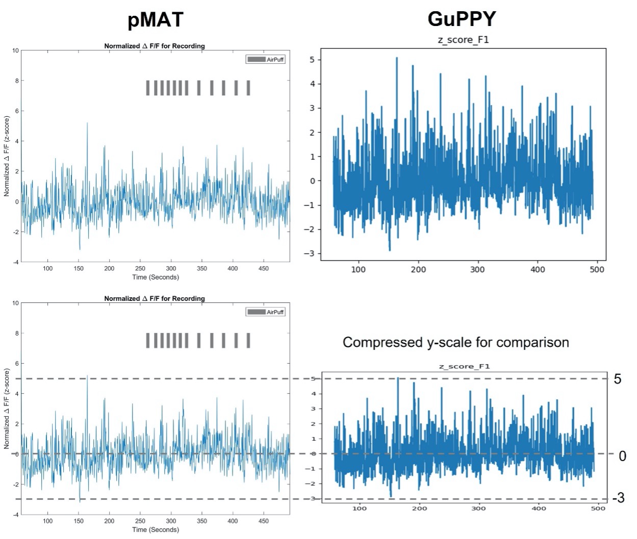
Figure 1. Isosbestic control corrected z-score full session data traces Calculations performed by pMAT (left) and GuPPY (right) result in similar corrected data. pMAT has the option to include TTL pulse events, AirPuff in this example. GuPPY does not give the option to include the TTL pulse events on the full session trace data. Figure 1B. Isosbestic control corrected z-score traces with compressed scale To highlight the similarities and differences, the GuPPY graph y-axis was compressed for an easier visual direct comparison between outputs.
In contrast to the full session data traces, the GuPPY and pMAT peri-event analysis outputs look startlingly different at first glance (Figure 2), but overall, the conclusion draw from these results is the same: there is an increase in activity prior to the AirPuff.
However, let’s talk more in depth about the differences we see. It is important to understand these differences to accurately compare the two tools. Let’s ignore the difference in y-axis and color- scales for now and talk about the timing of the peak activity first. pMAT clearly shows the peak activity pre-TTL while GuPPY shows a more extended peak period that extends to the zero-timepoint. To note, our AirPuff event was triggered by a keyboard press and therefore the TTL should slightly lag the event itself, so these results are not unexpected. It is likely a difference in binning between pMAT and GuPPY that resulted in these slight differences in timing. Contributing to this, in GuPPY I had to remove 58 seconds at the beginning of the file, while in pMAT I only had to remove 1713 data points (collected @30Hz). This results in a different number of timestamps used in pMAT vs GuPPY, slightly altering binning between the two. I think the difference seen here also nicely highlights the concept of timing in fiber photometry. Fluorescent signaling is not as fast as electrophysiology and therefore claims about precisely timed responses need to be considered carefully and experimentally verified.

Figure 2. peri-Event histogram and average line graph output pMAT (left) and GuPPY (right) peri-event analyses lead to the same conclusion: an increase in fluorescent activity prior to the event marking an AirPuff. Data are -1 sec to 2 sec around the TTL pulse. Both used a -1 sec to 0 sec baseline. In pMAT the Bin Constant was set to 1. In GuPPY the Window for Moving Average was 5 (int), while the Moving Window for Transients was 1 (sec).
Once I stopped admiring the pretty colors, it took me a minute to understand the y-scales. In GuPPY the line graph shows an average of 2 at time 0, but the heatmap clearly shows values around time 0 approaching 3 or more. Perhaps this difference is an effect of averaging across trials for line graph. It may also be that because this particular color scale is skewed towards warmer colors, the increase we perceive is overexaggerated. The good news, however, is that an average of 2 – 3 for peak response around time 0 is logical based on the z-score full data trace.
For the peri-event analysis in pMAT, the isosbestic correction is applied after the data were cut up into the peri-event time segments. Bruno et al. explain that doing the correction on the shorter timescale helps account for the moving average caused by photobleaching over time. For these data, this method resulted in the average peri-event z-score being greater than one would expect by looking at the full data trace: average of 6, compared to an average below 5 expected from the full trace data.
Finally let’s talk about formatting the peri-event graphs. In pMAT there is some ability to interact with the data within the figure windows. For example, a color bar can be added for the Heatmap. The color scheme can also be changed to other standard Matlab color pallets. GuPPY takes this a step further and has an interactive data viewer in which you can change the x- and y- ranges on the line-graph and change the color of the Heatmap. Overall, the GuPPY data viewer allows you to customize the peri-event plots more than pMAT and in a more intuitive way. However, both remain somewhat limited in figure customization. For example, you can’t change the font style or size in either program. I think these limits should be expected as both programs focus on data analysis and do not claim to have publication quality figure generators.
In summary, both programs can perform the same analyses and output both figures and data. Importantly, the isosbestic correction and z-score calculations result in similar data, with the main difference being the graphics of the figures. I didn’t see a large difference in the results between the two programs, therefore my preference considers other aspects like ease of use or batch file processing. My overall conclusion is that pMAT is more user friendly, but for more complex cases that need flexibility in the analysis, GuPPY is the program of choice.
Formatting Plexon datafiles for pMAT and GuPPY
As with any open-source software, data file organization is key for function.
Fluorescent data from Plexon’s Multi-Wavelength Photometry system is easy to format for pMAT. Data are exported in columns: frame number, timestamp, fluorescent data. Removal of the frame number column and all columns except the isosbestic signal of interest is all that is needed. You can see this illustrated in Figure 3.
One of the options in Plexon’s software exports fluorescent data from each wavelength into individual files. This is helpful, as GuPPY requires each signal and control to be in its own file. Once the data are exported from Plexon’s system, the headers must be changed to: timestamps, data, sampling_rate. The headers must be exactly as in the sample csv files provided by GuPPY. The frame number column in the Plexon exported file should be deleted and the sampling rate (30Hz) must be added as a third column. All together these changes are straightforward (Figure 3).
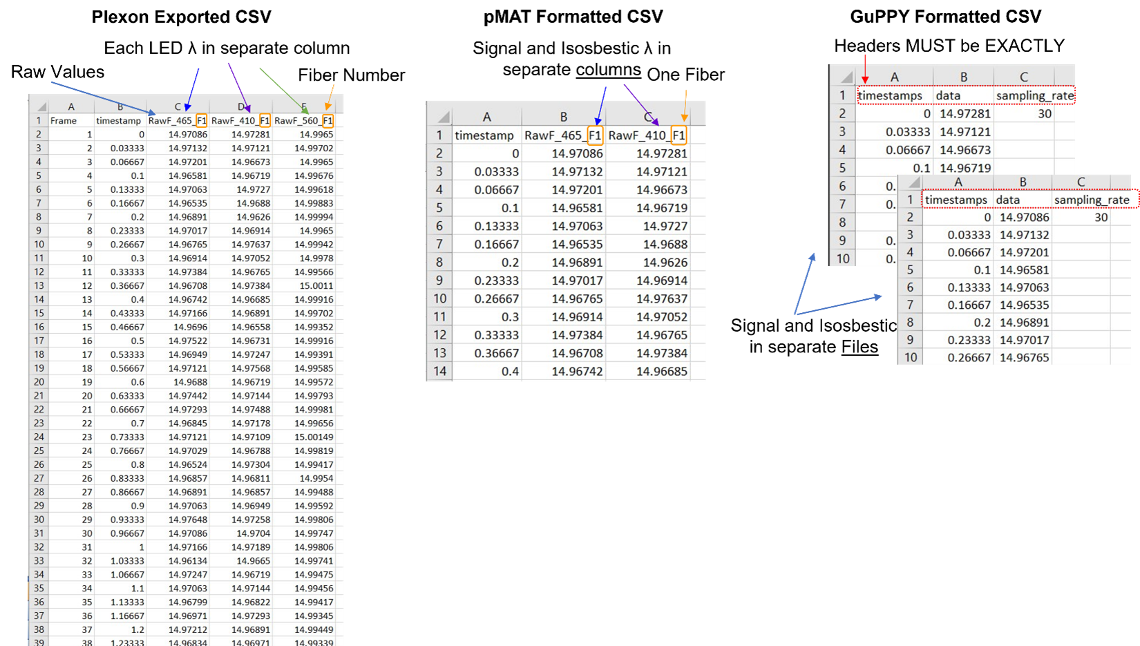
Figure 3. CSV file formats for fluorescent data pMAT and GuPPY have different required data organization for CSV files. Here is a comparison of the raw data exported from Plexon’s multi-wavelength fiber photometry system, with the required formats from pMAT and GuPPY. > Formatting for pMAT requires a timestamp column and both the signal and corresponding isosbestic raw vales in a single file. The column headers can be anything, but all three columns must be in the order shown here. >GuPPY formatting requires separate files for the signal and isosbestic data. Headers must be exactly as shown in every file. Filename does not need to have a specific format, but keep in mind the Storenames cannot be the same as the filename.
Formatting the behavioral TTL file is a bit more involved. Plexon exports column of continuous timestamps and separate event columns with either a 0 or 1 to indicate the occurrence of that event during that frame. One indicates the concurrent TTL event, and 0 indicates no event. GuPPY very simply wants a single column of timestamps for each occurrence of the event, with different events saved in individual files (Figure 4). pMAT wants not only the first timestamp, but also the last timestamp for each occurrence of every event (Figure 4). Right now, pMAT does not use the offset of the TTL in any calculations, so this column can be all ones or zeros. However, the authors of pMAT stated the intention to include analysis of behavioral events that occur between two timepoints, therefore it is best to accurately include offset now to prevent future issues.
A TTL is normally 0.1sec, and with a collection rate of 30Hz, this means each TTL pulse is at least 4 datapoints. However, onset and offset of TTLs don’t perfectly align to frame rate collection, so I found that there was some jitter and TTL pulses lasted 4 – 6 datapoints. This makes it more difficult because you won’t be able to simply select each 4th datapoint.
From the thousands of timestamps collected in each datafile, identifying the relevant timepoints in the Plexon exported csv file takes some effort. If you don’t have too many event occurrences, you can identify each event manually as illustrated in Figure 5. After the event timestamps are found, the data need to be saved in new CSV files.
However, doing this for every file, with multiple events would be very time consuming for a full experiment. Therefore, Plexon has created an Excel spreadsheet to help to streamline this process. This file is available upon request from a Plexon Sales & Support team member. In the video associated with this post I demonstrate how to format these data manually and how to use this “cheat sheet,” which only requires a simple copy-paste from you.
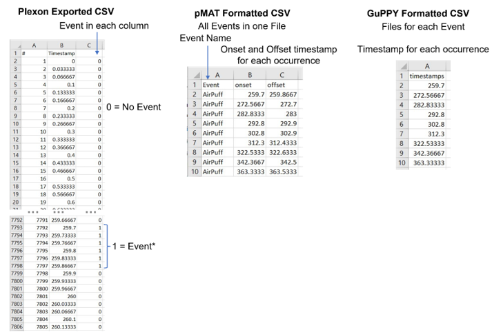
Figure 4. CSV file formats for Behavioral data pMAT and GuPPY have both require discrete timestamps for event occurrences. > Formatting for pMAT requires three columns. The first listing the event name that corresponds to the onset and offset timestamps in the second and third columns. Multiple events with different names can be in the same file if distinguished by a unique event name. >GuPPY requires a single column of timestamps for each event occurrence. Each event should be in a separate file. The header must be “timestamps” in lowercase.

Figure 5. Finding event occurrences in Plexon exported behavioral data file
1. Select all three columns and use the Sort tool. Sort by the third column (C), from largest to smallest. This will bring all occurrences of the events to the top of the column. They will automatically be from smallest timestamp to largest.
2. The nest step is to find the onset and offset of each event occurrence. The onset timestamp will be the smallest in a consecutive set. Each timestamp in a occurrence is 0.03 sec different from the previous because the collection rate is 30Hz. The offset is the last timestamp in a consecutive set.
3. For pMAT paste the onset and offset times into a new csv file. For GuPPY paste just the onset timestamps into a new csv file.
My Experience with pMAT
Loading Data into pMAT
Other than the Import Data feature being strangely difficult to find, loading data was straightforward. It might just be me, but I had to watch the Import csv data YouTube video provided by the developers to find this feature.
The Import Data menu is in the upper left corner where “File” would be in Microsoft Word. I think what made it difficult to find is that it is the ONLY option up there and unlike to the rest of the interface it isn’t a button, but a dropdown menu so it doesn’t stand out as interactive.
Once you select to import data, a file navigation window opens. Importantly the fluorescent data must be loaded first, then a second window will open for behavioral data selection. At the top of the file navigation window is a label for which file should be selected, but it is not immediately obvious at first look.
I have little else to say here because it was such a straightforward and painless process to import my data file and analyze it. All I had to do was select some check boxes and enter some numbers. It was also nice that I could do each analysis individually or run them all together. I would highly recommend pMAT for those just starting fiber photometry as it will let you easily and quickly take your data from just numbers to informative graphs.
Disadvantages for pMAT
In my opinion the biggest disadvantage for pMAT when using csv file data is that there is no batch function. Each day, each subject, and each signal wavelength (i.g. GCamp vs. RCamp) must be loaded and run one at a time. This especially comes into play when you want to look at group averages, which would require running each individual subject before you manually compile the pMAT output. This also means you would either need to average and re-run data to get group graphs or would have to use an additional analysis code.
One consideration is that if using pMAT within the MATLAB command prompt, you could write a code (or edit pMAT’s) to do a batch analysis using CSV files. However, this is not something I would expect beginners to tackle, and I do hope the pMAT developers follow through on adding batch functionality in a future release.
pMAT is very easy to use, but it lacks flexibility. For instance, you must have some sort of control, be this isosbestic or a background/ black level control. In addition, if any large artifacts that will significantly impact the calculations must be removed manually prior to analyzing data.
Do these disadvantages overshadow how easy pMAT is to use? In my opinion? Absolutely not. For initial analysis and data visualization pMAT is quick and easy. I think people will find pMAT very useful despite its limited versatility.
My Experience Using GuPPY
Loading & Running Data in GuPPY
From the very beginning when I was trying to learn the program using the provided sample csv datafiles I encountered errors. Because each error was different, occurred at a different stage, and the error language was un-informative to me as a user it was incredibly frustrating. At first, I didn’t even realize I was encountering an error because they are shown in the Anaconda window, which is open in the background, behind the graphical user interface that GuPPY opens.
I was very frustrated. This is the main downside to open source. Programmers try to anticipate all the mistakes- stupid, obvious, or inadvertent that a new user will make, but it is an uphill battle. It is why, even years after the initial release, many companies still fix bugs and errors in software.
However, I give the authors of GuPPY a huge amount of credit that they responded to an issue I posted on GitHub about “Chunked Data.” They responded in about 10 days, which I think is reasonable considering that they are also working in the lab full time. Once I got the initial response a Zoom call was quickly scheduled. My mistake was quickly pointed out as we walked through what I was doing. Not surprisingly, the error was caused by a simple mistake.
The issue was that I was using the data filenames as my Storenames. Storenames are the names you assign to each datafile you import and are used to match signal and isosbestic data. Based on the other issues posted on the GitHub page and some of the other errors I encountered, correctly assigning Storenames is a stumbling block. Some general rules I learned to follow when experimenting with my data from Plexon:
- Storenames cannot be the same as the file name
- Fluorescent data Storenames must be “signal/control_region”. Region must match between the two and the words must be exactly “signal_” or “control_”.
To me it wasn’t obvious that the naming explained in the GitHub Wiki was absolute. For my data I settled on:
- signal_F1 (for fiber 1 465 signal)
- control_F1 (for fiber 1 410 isosbestic)
- AirPuff (for TTL event)
After I got the sample data working, I started trying my own data from Plexon’s system. Again, I ran into another error, “line 14780 out of bounds for axis 0 at 14780”. I eventually narrowed it down to something specific about my data. I had already successfully run these data through pMAT, so I knew they were possible to analyze, I just had to figure out why it was giving me problems in GuPPY.
Going back to my original datafiles, I did find that my control and signal data had unequal row numbers. The 410nm signal had 14781 datapoints, which was one less datapoint than the 465nm signal. Plexon’s system alternately collects a 465nm sample and then a 410nm sample on the same camera running at 60Hz. Due to this, a final sample of 410nm was not collected. This was a bug in the Plexon software and has since been fixed resulting in equal column lengths every time. However, in this case, to fix the uneven rows I simply deleted the extra 465nm datapoint and restarted GuPPY.
After running the analysis again, I received the same “out of bounds” error. I did further testing, and my results for the root cause of the error were inconclusive. Having exactly 14780 datapoints worked, as did having 14778, but not 14779, and if I added fake datapoints to equal 14785 frames, it worked. I eventually settled on using 14780 datapoints. This was a loss of two datapoints, which while annoying to deal with, was acceptable. Since I couldn’t figure out the root cause of the error, and didn’t have issues with other files, I concluded it was something specifically about this datafile, and I hope no one else encounters an error like this.
After I got my data to successfully run, I started changing analysis parameters. This is when I started realizing how difficult it is to write instructions that everyone can quickly and easily understand. *Hats off to technical writers* After some careful reading of the GitHub wiki I appreciated how much detail and effort the author put into their explanations.
The GuPPY programmers clearly went the extra mile to create a useful analysis tool that can be used in many situations with many types of photometry data. Once I made it past all the errors and learned each setting, I found GuPPY to be a very powerful tool.
Disadvantages for GuPPY
GuPPY is extremely flexible in that it can handle many formats of data, group analysis, and batch analysis of multiple regions, fibers or even wavelengths in one run through. However, this ultimately creates its primary disadvantage: there is a significant learning curve. Data must be perfectly formatted, named (including capitalizations and spacing), and all parameters need to be understood and correctly set before anything can be analyzed. This can make it extremely frustrating to new users (speaking from experience). If you are planning on using GuPPY, make sure you very carefully and thoroughly read the instructions. Also, don’t expect to go through it error free first-time, especially if you are using data from a non-TDT system.
Is GuPPY worth the work? Yes. Taking the time to understand how to use GuPPY can result in saving a lot of time when doing batch or group analyses. And the added flexibility of GuPPY when an isosbestic wasn’t collected or large artifacts need to be removed makes the effort of learning worth it.


Additional resources: pMAT vs GuPPY Video Analysis: Multi-Wavelength Photometry Open-Source Parts 1-4
Bruno et al. (2021) pMAT: An open-source software suite for the analysis of fiber photometry data. Pharmacology, Biochemistry and Behavior 201, 173093.
djamesbarker/pMAT: Fiber Photometry Modular Analysis Tool Suite (github.com)
Sherathiya et al. (2021) GuPPY, a Python toolbox for the analysis of fiber photometry data. Scientific Reports 11, 24212.

Written by Kristin Dartt